A D2C product page that earns the add-to-bag.
We redesigned Flawsome's product detail page from a generic Shopify theme into a confident, conversion-oriented PDP — brand identity, bundle pricing, trust signals and mobile-first hierarchy, all working together above the fold.
Same product. Same Shopify backend. A completely different first impression.
Most D2C revenue happens on mobile. The redesign was built for that.
The brief
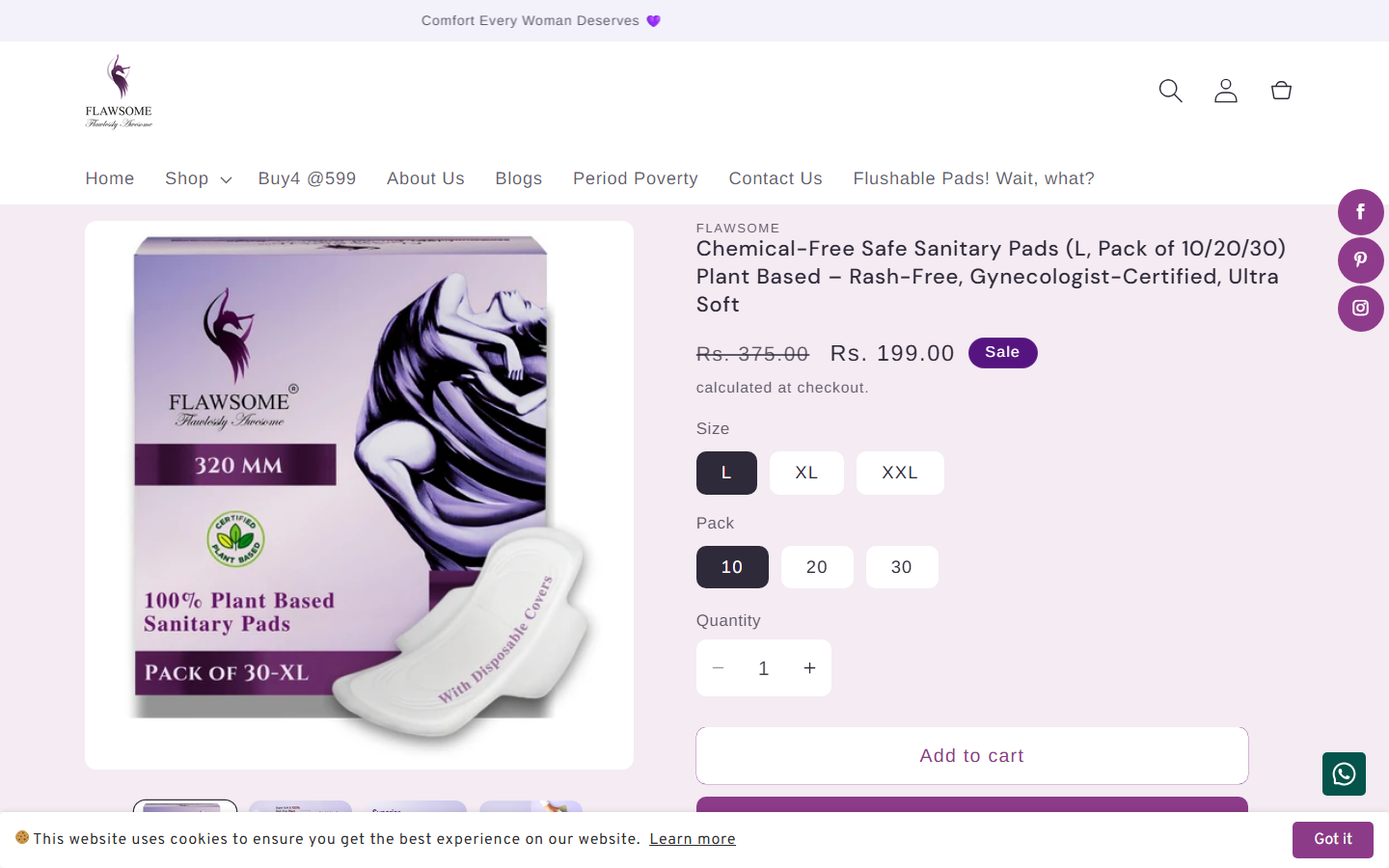
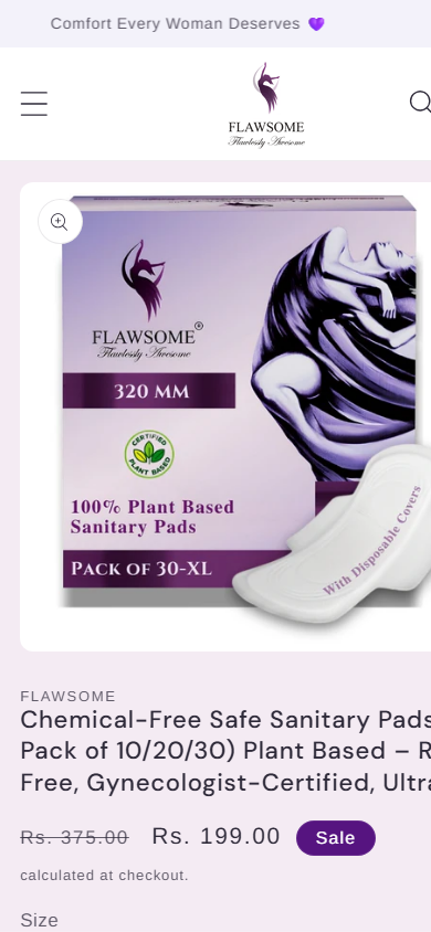
Flawsome is a D2C sanitary-pads brand built on Shopify. The old product detail page worked, but it looked like the theme — not the brand. Generic typography, one product image, a long title doing all the heavy lifting, and the trust signals that actually convert (ratings, feature chips, bundle pricing) buried below the fold or absent entirely.
The goal: a PDP that reads instantly as Flawsome, not as a Shopify theme — and does the persuasion work that the long description used to do alone.
Six design moves that did the work.
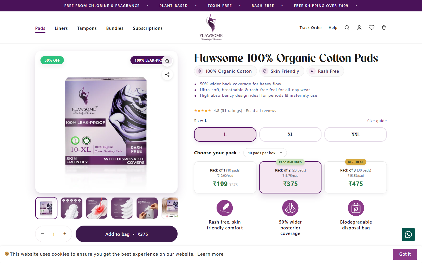
A real brand identity, applied end-to-end
Generic Shopify-theme look replaced with a confident, consistent purple system — applied to the announcement bar, badges, CTAs, swatches, and product photography. The PDP now reads as one cohesive brand world instead of "a theme with a logo dropped in."
Proof above the fold, not buried below it
4.8★ rating with 51 reviews, the "100% Leak-Proof" pack overlay, and a row of feature chips (100% Organic Cotton · Skin Friendly · Rash Free) all visible before the user scrolls. The old PDP buried these signals; the new one front-loads trust before the price is even considered.
Bundle pricing UI that does the upsell on its own
Three visual pack cards — Pack of 1 · Pack of 3 · Pack of 6 — anchored against a higher MRP, with the middle option flagged "BEST VALUE". The same proven mechanic D2C category leaders use to lift AOV without an upsell modal.
Benefit pills that close the sale
Directly below the CTA: three benefit chips — "Rash-free, skin-friendly comfort", "30% wider coverage", "Biodegradable disposal bags". Each closes a specific buying objection. The old PDP relied on a long product description that most users never scrolled to.
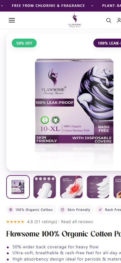
Mobile-first hierarchy
On mobile, the thumbnails sit cleanly below the hero (not crammed into a side strip), feature chips wrap into thumb-friendly rows, and a clear bullet list under the title delivers the benefits scrollable users actually read. Every touch target sized for one-handed reach.
A tighter, more confident product name
From "Chemical-Free Safe Sanitary Pads (L, Pack of 10/20/30) Plant Based — Rash-Free, Gynecologist-Certified, Ultra Soft" to "Flawsome 100% Organic Cotton Pads". The benefits move into chips and pills — the name does what a name should: make the product easy to remember and recommend.
The result
The new PDP no longer relies on the customer reading a long description to be convinced. Trust, value, and brand are all communicated in the first viewport — on mobile and desktop. The bundle UI nudges toward higher cart value without a single pop-up. The product name stops apologising and starts inviting.
Same product. Same Shopify backend. A PDP that finally sells the way the brand deserves.
Want a PDP that actually sells?
Start with a free audit — we'll show you exactly where your product pages are losing trust, value, and the click.